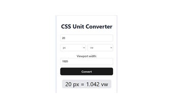
Efficient CSS Unit Converter for Web Design
The CSS PX, REM, EM, VH, VW Converter is a browser add-on designed for Chrome users. This free tool enables web developers to effortlessly convert various CSS measurement units, including pixels (px), em, rem, viewport height (vh), and viewport width (vw). By facilitating quick conversions, it supports responsive web design, ensuring that layouts remain consistent across multiple devices and screen sizes.
Understanding the distinctions between these units is crucial for effective web development. Pixels serve as absolute measurements, while em and rem are relative to font sizes, allowing for scalable designs. Additionally, vh and vw provide viewport-based measurements, making it easier to adapt to different screen dimensions. This converter simplifies the process, allowing users to instantly transform values like 10px into rem, enhancing overall design efficiency.